Structured Content and the Headless CMS
I tend to get questions about headless CMSes:
- What is a headless CMS?
- How does a headless CMS work?
- Should I get one?
There’s a lot of buzz around “going headless” these days. And these are valid questions that deserve to be answered. But they’re also usually the wrong questions to start with. As structured content trailblazer (and Director of Content Strategy Relations for a headless CMS provider) Carrie Hane noted at the Structured Content conference in May: “A headless CMS won’t solve your content problem.”
In some cases, it could actually make it worse.
For most organizations, the most important thing a headless CMS will help you do is to create well-structured content. Carrie defines structured content as “content that is divided into the smallest reasonable pieces and explicitly organized and classified in order to be understood and used by computers and humans.” I love this definition, but it doesn’t quite paint a picture of what structured content accomplishes. Here's an example to help paint that picture.
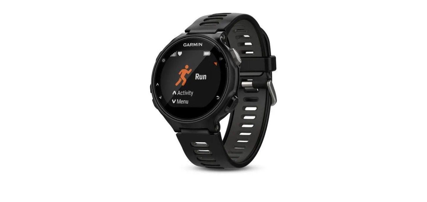
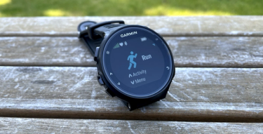
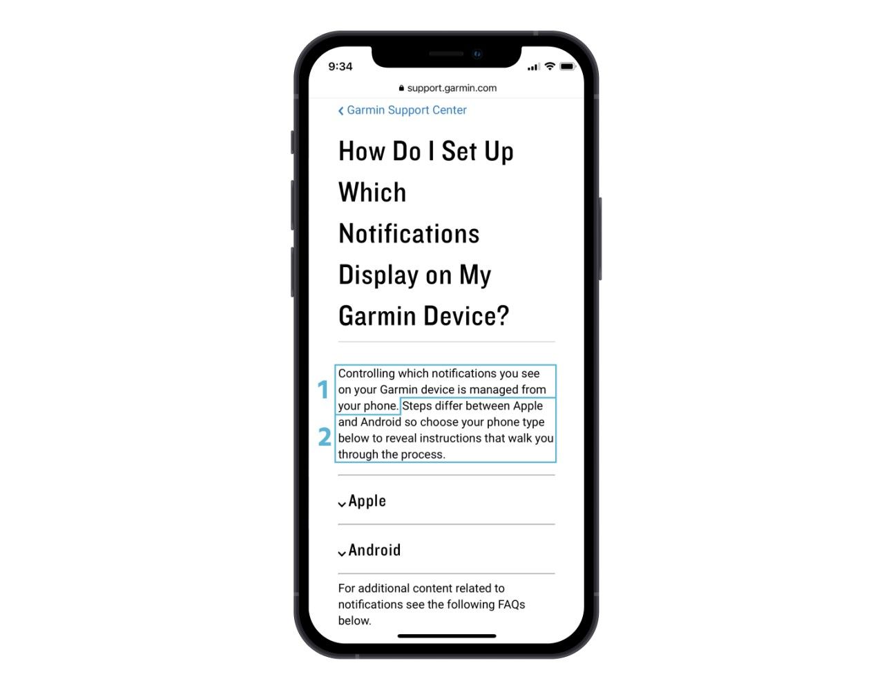
Say you’re a user of a GPS running watch, like this Garmin Forerunner. It’s a pretty intuitive gadget (for a smartwatch), but sometimes you just need the manual. Fortunately, there is a “help” section in the accompanying Garmin iPhone app. Unfortunately, to get to any actual instructions, the app pushes you out to Garmin’s mobile web site.
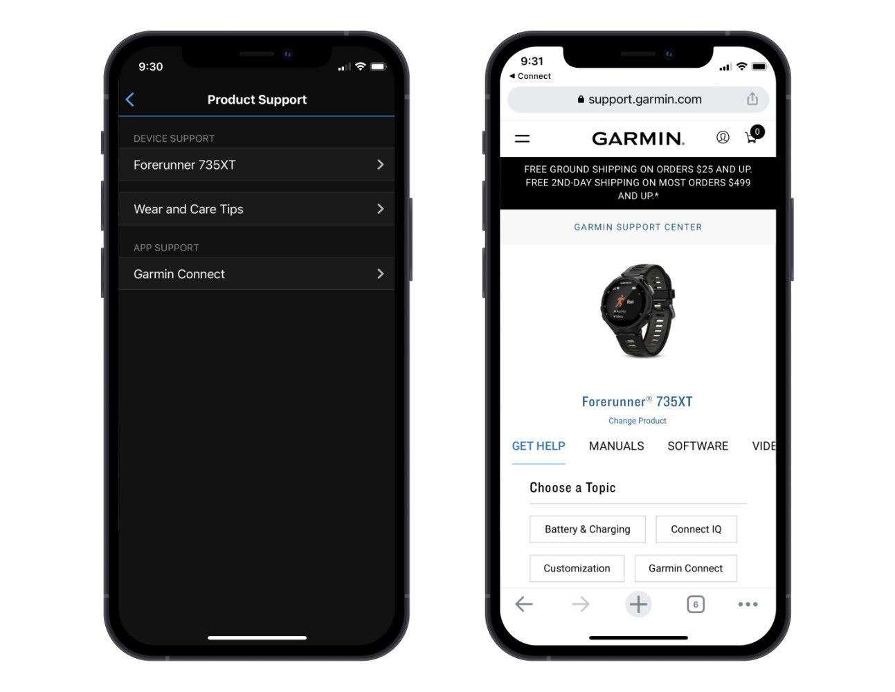
This isn’t a terrible experience—Garmin kindly lands me on the help page for my watch—but I’d really rather stay in the app. The help site necessarily includes information and navigation I don’t need or want, and instructions and steps for other devices I’ll never use. It also strikes me as not designed as a mobile first experience.
I don’t work with Garmin, so I won’t presume to know what their design constraints or resources are, but one hypothesis for why they don’t have this help content in context in the app is that it is being created explicitly for the website. Recreating those web pages in the app may mean either rekeying the content (and then trying to keep it up to date), or plopping it into the app as a WebView, which often ends up being worse than just pushing someone to the website proper. The problem is (likely) that help content has been authored not as a set of ideas to communicate, but rather as pages—in this case, pages for a desktop website.
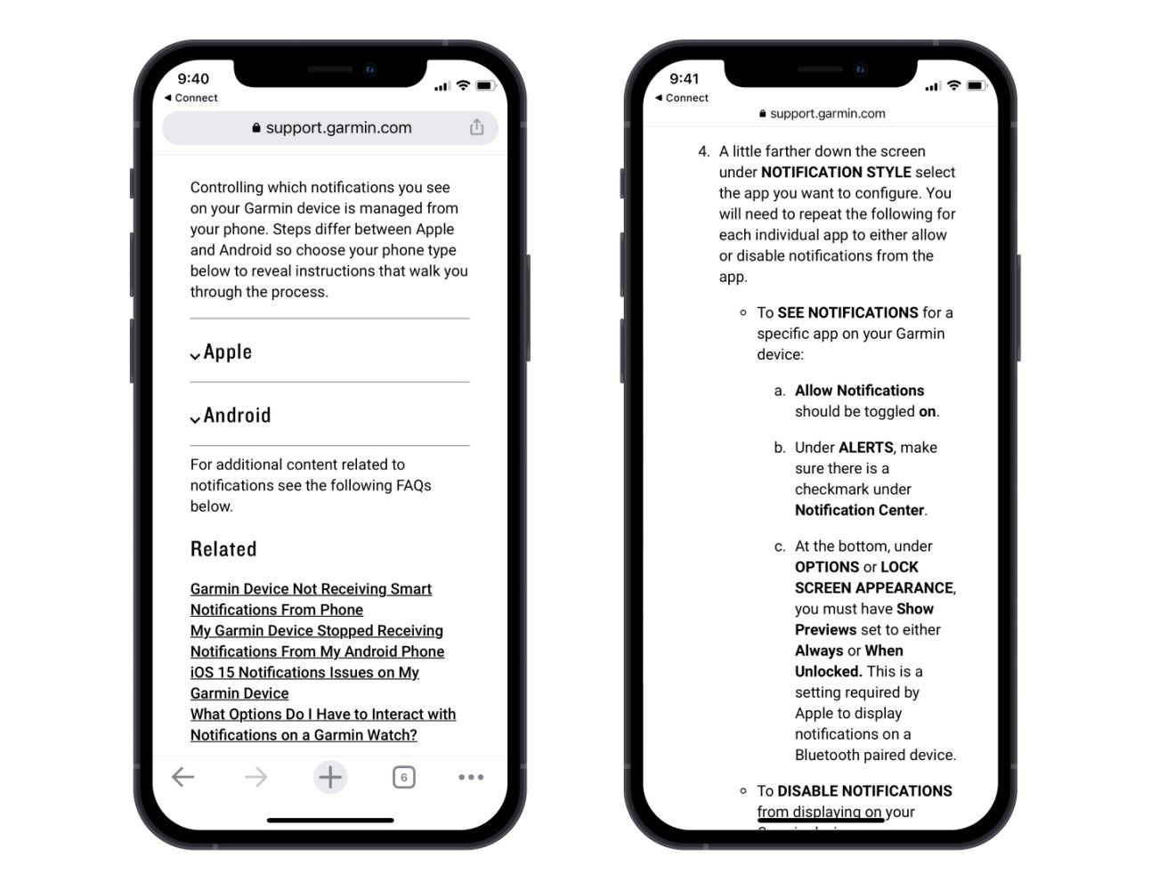
This is where structured content can help. In a structured content solution, help content is broken into small, meaningful chunks, each of which are described in a way that communicates that meaning. The smallest “meaningful chunk” of the notifications instructions above would likely include the Apple and Android instructions—each as a chunk and each described in a machine readable way as specific to those platforms—and an introductory paragraph that includes only the first sentence if your device is known, and adds the second sentence if not—say, if you’re visiting from a web page.
When content is described in this way, it becomes possible to instruct the native app to show only the content relevant to the device on which it’s running, and for the web site to choose to show both sets of steps and the additional context about operating systems. If that content is authored and managed in a headless CMS, both website and native application can draw on the same source (the headless CMS’s content API) for their content. The headless approach means each device can rely on a single source of truth, and display only the content it needs in the way that best suits its particular context and platform.
And here, finally, is why a headless CMS alone isn’t the solution to the “built for pages” content problem: if your content is not structured meaningfully, and is not described in a way that communicates that meaning in a machine readable way, you stand a good chance of ending up with the same problem you started with: content structured not as a set of ideas to communicate, but as a collection of pages.
This is a simple illustration, but also a real world context—one which, I’m not going to lie, is relevant to more than a couple devices in my house alone. It also shows what's possible when you make the shift from thinking about content as pages to thinking about content as a set of ideas, concepts, and facts to communicate, each described in a way that conveys its meaning in a machine readable way. Cross-channel publishing, as shown in this example, isn’t where the benefits of this approach end: we’re only just beginning to understand the potential structured content holds for personalization, localization, SEO, voice and chatbot design, and knowledge graph and semantic web integration.
As for web “pages,” they’ve been a good metaphor to help us get our heads around the mind-blowingly surreal fact that we now have so much knowledge instantly available at our fingertips. But it’s time to move on. If you create content that will be consumed online, embracing structured content is a great way to start.